The Notify Me button looks like the simplest part of a store: a button, an email field and a thank-you message. For a shopper who navigates by keyboard or uses a screen reader, it is also several places to get stuck. A sold-out page is already a point where a sale is at risk, and a signup flow that cannot be used turns a recoverable moment into a dead end. This shopify back in stock button accessibility checklist covers what to test, using principles from Shopify's own developer accessibility guidance, applied to a restock signup.
Why It Matters for a Sold-Out Page
Most accessibility advice focuses on checkout and navigation, and a back-in-stock widget gets overlooked because it only appears on some products. But it is often the only action available on the page. If a shopper using a screen reader cannot find the button, or a keyboard user cannot close the dialog, there is nothing else on that page for them to do. It is also a form that collects personal data, which means errors and confirmations need to be communicated clearly. No source ties these rules to back-in-stock widgets specifically, but the underlying guidance applies directly to any button, modal and form, which is exactly what this is.
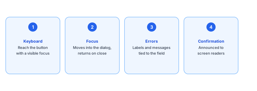
The Checklist
1. Can you reach and use the button with a keyboard?
Put your mouse aside and press Tab. You should land on the Notify Me button, see where you are, and be able to activate it with Enter or Space. A visible focus indicator is required; if the outline disappears because of a theme style, keyboard users lose their place. The button should be a real button element with a clear label, not a styled div that only responds to clicks.
2. Does focus behave inside the dialog?
If the signup opens in a modal, focus should move into it on open, stay trapped inside while it is open, and return to the Notify Me button when it closes. Escape should close it. If tabbing wanders into the page behind the dialog, keyboard and screen reader users are effectively navigating a page they cannot see.
3. Are form labels and errors programmatically tied together?
The email field needs a real label, not just placeholder text that vanishes when typing. When something goes wrong, such as an invalid address, the error message should be associated with the field so assistive technology reads it, and the message should say what to fix, not just that something failed. Color alone should never be the only signal of an error.
Test your own signup flow against this list. Griffin adds Notify Me to sold-out products.
Install Griffin on Shopify4. Is the confirmation announced?
After submitting, a visual thank-you message is not enough on its own. A screen reader user needs to hear that the signup worked, which usually means the message appears in a status or live region so it is announced when it shows up. Without that, someone is left wondering whether to submit again.
5. Is there enough contrast and room to tap?
Text and button colors need sufficient contrast against their background, and the button should be large enough to tap comfortably on a phone. These are easy to break when a theme restyles an app block. If you are fitting the widget into a custom theme, our guide to making the back-in-stock button work with a custom theme covers the styling side.
How to Test It in Ten Minutes
You do not need specialist tools to catch the big problems. Use only the keyboard to complete the whole flow on a sold-out product: reach the button, open the dialog, fill in the email, trigger an error on purpose, submit successfully, and close. Then turn on a screen reader built into your computer and repeat it, listening for whether each step is described and the confirmation is announced. Anything that required the mouse, or that you could not understand by sound, is worth reporting to the app's developer. If you have not set up the button yet, start with our guide to adding a Notify Me button to your store.
Accessibility is shared between the app and your theme, so test on your live store. We do not claim any widget passes every check on every theme, including ours, which is why testing your own setup is the reliable answer.
FAQ
Does a back-in-stock widget need to be keyboard accessible?
Yes. Every button and form field should be reachable and usable with the keyboard alone, in a logical order, since some shoppers cannot use a mouse. Tab through the whole signup flow to check.
How should the signup confirmation be announced to screen readers?
A message that appears after submitting should be announced without the user hunting for it, typically through a status or live region. Silent visual-only confirmations leave screen reader users unsure whether the signup worked.
What should happen to focus when the Notify Me modal opens?
Focus should move into the modal, stay inside it while it is open, and return to the button that opened it when it closes. Without that, keyboard users can end up tabbing through the page behind the dialog.
Is accessibility something the app or the theme controls?
Both. The widget supplies its own markup, but your theme controls surrounding styles such as focus outlines and contrast. Test the widget on your live theme, not in isolation.
The Bottom Line
A Notify Me signup is small, but it combines a button, a dialog, a form and a confirmation, and each can fail someone. Check keyboard access, focus, labels and errors, and announcements on your own store, and raise gaps with the app developer. Griffin is a Shopify back-in-stock app you can install from the Shopify App Store, free to start, and the checklist above is a fair way to evaluate it or any other.