Once a product sells out, the shopper's next step is up to you. Either a Notify Me button opens a popup asking for an email address, or the signup form sits right on the page for any sold-out variant. Both work, and which one signs up more shoppers is a question many merchants ask. We looked for independent data comparing the two and did not find any, only vendor guidance and common sense. So this post will not claim a winner or quote conversion numbers. It covers how the options differ, what to watch on mobile, and how to run a fair test.
The Two Patterns
A popup, often called a modal, keeps the product page clean. The shopper sees a Notify Me button where add to cart used to be, taps it, and a small form appears over the page. An inline form skips that step: the email field and submit button are shown directly on the page for the sold-out variant. Griffin's widget supports both. The default is the button that opens a popup, and you can switch to showing the form inline, with styling that either inherits your theme or uses its own colors, border and padding.
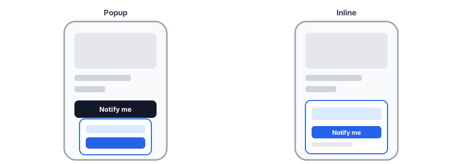
What Each One Trades Off
Popup
The popup keeps the page uncluttered and gives the form a focused moment. The cost is one extra tap, and a dialog that must behave properly: focus should move into it, Escape should close it, and it should be easy to dismiss on a small screen. We cover those details in our accessibility checklist for the Notify Me button.
Inline
The inline form removes the extra step and makes the offer visible at a glance. The cost is space. On a phone, an email field plus a button can push the description or reviews down the page, and the on-screen keyboard can cover the field after the shopper taps it. If your theme has a sticky add-to-cart bar, make sure the form does not end up hidden behind it.
Mobile Details That Decide It
- Tap target. The button or submit control should be large enough to hit comfortably with a thumb.
- Position. Put it where the buy button would be, in easy reach, not below a long block of text.
- Keyboard. After tapping the email field, check that the field and the submit button remain visible above the keyboard.
- Variant changes. When a shopper switches size or color, the form or button must update to match, which is the subject of our post on the button disappearing on a variant switch.
- Theme fit. On a custom theme, check the result on real devices; see our custom theme guide.
Try both layouts on your own store. Griffin lets you choose between a popup and an inline form.
Install Griffin on ShopifyHow to Run a Fair Test
Shopify does not give you a built-in split test for this, so the practical method is to run each version for an equal stretch of time and compare. A few rules keep the comparison honest.
- Measure signups divided by views of sold-out product pages, not signups alone, since traffic changes.
- Run each version for the same length of time, ideally covering the same days of the week.
- Change only the layout. Keep copy, button color and everything else identical.
- Split results by device. Mobile and desktop behave differently, and mobile usually deserves the most attention.
- Wait for enough sold-out views. A few signups either way is noise, not a result.
- Watch for confounders such as a sale, a viral moment or a product that restocked mid-test.
The decision also depends on your catalog. A store with many sold-out items may care more about keeping pages tidy, while a store with a few high-demand products may prefer the most visible offer. If you have not added the button yet, start with our guide to adding a Notify Me button to your store.
FAQ
Is an inline form or a popup better for back-in-stock signups?
There is no independently published comparison that settles it. Vendor guidance generally calls inline the simplest for shoppers and says popups should be easy to dismiss and tap-friendly on mobile. The honest answer is to test both on your own traffic.
Do popups hurt SEO on product pages?
A popup that opens only when a shopper taps a button is unlikely to cause problems, according to vendor guidance, unlike one that covers the page on arrival. Avoid anything that blocks content as soon as the page loads.
Where should the Notify Me button go on mobile?
Where the add-to-cart button would normally be, so it is in easy thumb reach and replaces the action the shopper came to take. Check it does not collide with a sticky add-to-cart bar.
How long should I run a placement test?
Long enough to collect a meaningful number of sold-out page views for each version. A handful of signups is noise. Run each version for equal time with similar traffic, and change nothing else at the same time.
The Bottom Line
Popup and inline each have real trade-offs, and no published evidence picks a winner for every store. Check both on a phone, then compare them over equal periods using signups per sold-out page view. Griffin supports both layouts, and you can install it from the Shopify App Store, free to start.